
Project // gforce Supplements
Project Type: Brand Identity & Packaging Design
Overview: gforce Supplements is a Bristol-based performance nutrition brand built for individuals pushing their physical limits in and out of the gym. Positioned within a highly competitive market, the brand centres on strength, consistency, and measurable results, appealing to a focused, performance-driven audience seeking reliable, effective supplementation to support their training and recovery.


“gforce is currently in the process of rebranding to redefine their market position to one of high quality. We are looking to create a more streamlined and sophisticated look for our brand, with less clutter on our labels and a more upscale feel overall.”
Descriptive keywords: contemporary, sophisticated, masculine.
Conceptual & Visual Development
Route 01 //
This brand direction uses a ‘dual’ type logo and alternates between a ident and a wordmark while maintaining the ‘>’ or ‘arrow’ element when suitable. The logo itself communicates movement, forward progression, potential and being carried forward by gforce.

Route 02 //
This logo employs and extended ‘G’ which hints at improvement through repeated action, good habits, progression while also mirroring blurred movement - much like a centrifuge, ‘gforce’ is used to extract and amplify potentialities. Additionally, the element takes the shape of the supplement capsule itself.

Design Solution
The identity is anchored by a lowercase, italicised g, referencing gravitational force as both scientific symbol and brand ethos. The letterform communicates momentum and precision from the mark itself.
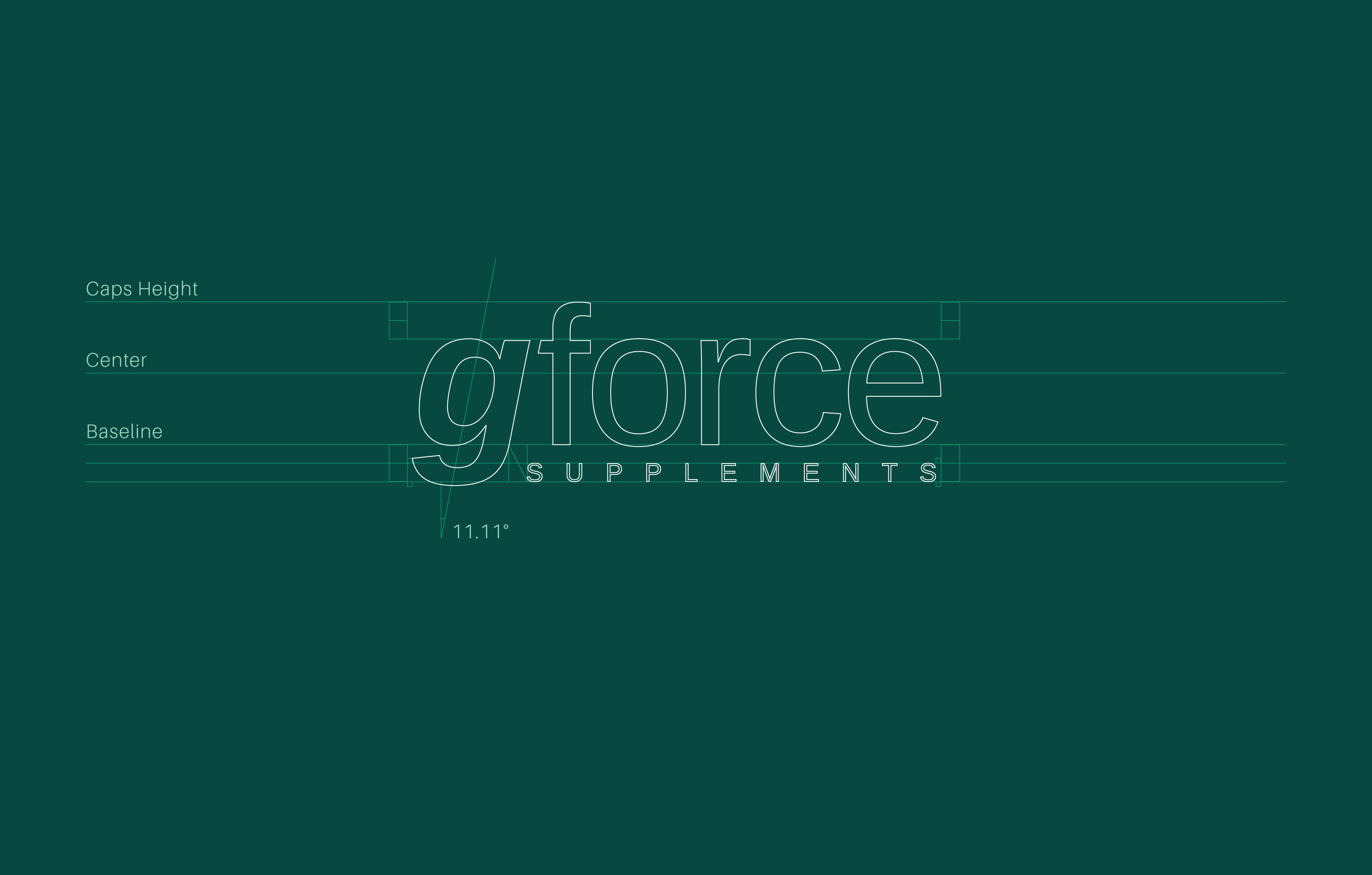
The typography conforms to the baseline and is a mixture of ‘Arimo Bold Italic’ & ‘Regular’. The Italic ‘g’ sits at a skew of exactly 11.11 degrees signifying manifestation and actualization of goals; through gforce.
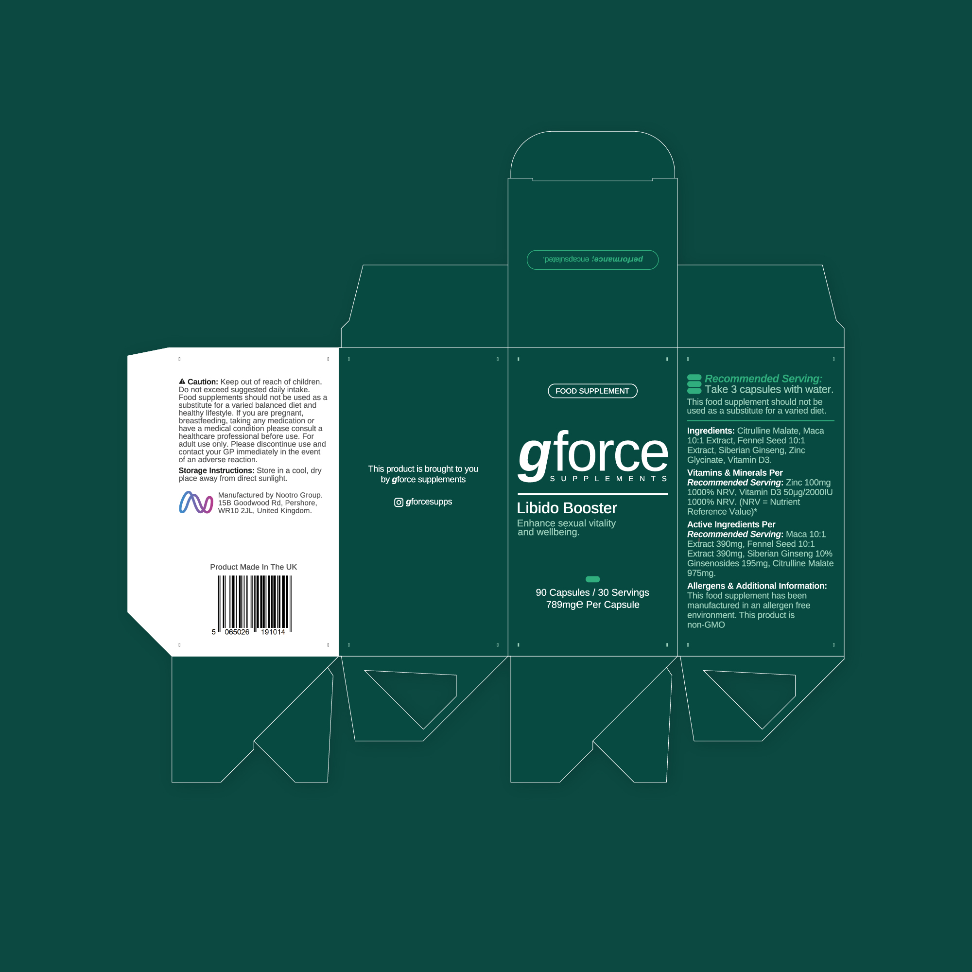
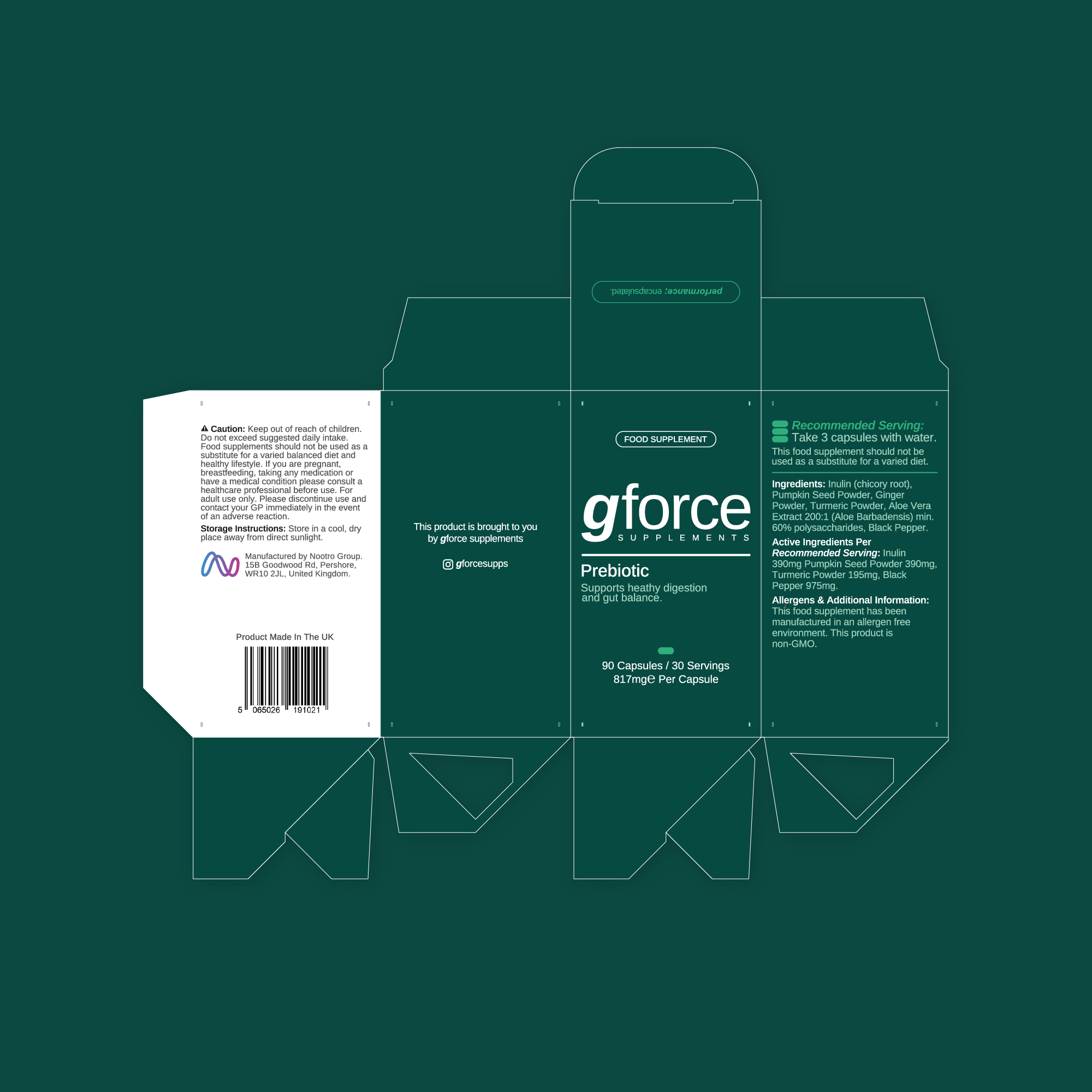
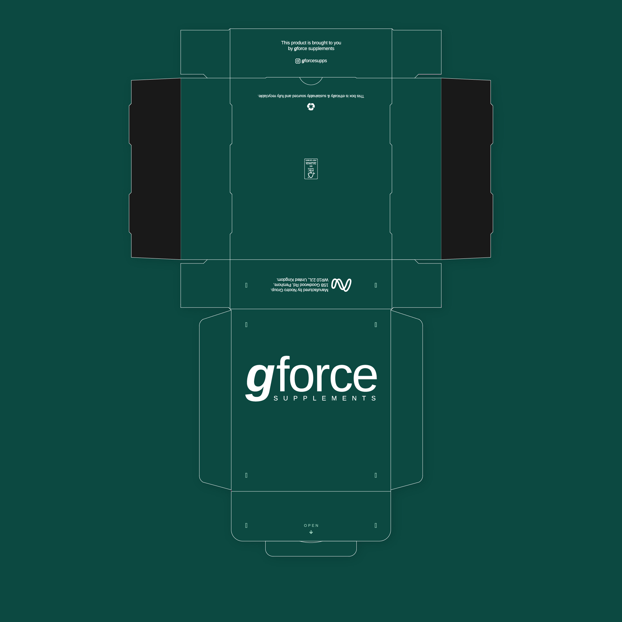
The second sprint to the project, saw the design of the new product range, equipping gforce with a consistent; masculine presence. Subtle micro-graphics were implemented to further push the contemporary aesthetic.
"Will's brand and packaging design work is phenomenal. We came to him needing to reposition gforce as a more sophisticated brand and what he delivered did exactly that. The identity has genuinely shifted the perception of the brand, giving us the presence we needed to enter a more premium market with confidence. If you're serious about your brand, Will is the guy for the job."
Angus Belgard // gforce Supplements
▼
Start Your Project
Got a project to start? Click Get Started below.


