
Project // One Skateboards
Project Type: Brand Identity, Web & Product Design
Overview: One Skateboards is a community-driven skate brand built around the idea of unity, connection, and a more grounded approach to skate culture. Rooted in the ethos of “oneness,” the brand moves away from the aggressive, high-impact stereotypes often associated with skateboarding, instead celebrating inclusivity and the shared experience of riding.
As Featured On DesignRush

“We need a logo that’s all about unity, not that in-your-face skate scene, and it’s gotta' look good on decks, merch' and our 'site.”
Descriptive keywords: natural, oneness, unity.
Conceptual & Visual Development
Route 01 //
The first conceptual route saw a geometric wordmark with an elongated ‘O’, with a skateboard sat within the negative space. This was then made imperfect in order to communicate the organic nature of the brand.
Route 02 //
Route two renders the ‘O’ as an abstracted tree-knot, communicating the source and the communication of nature within the brand.
Design Solution
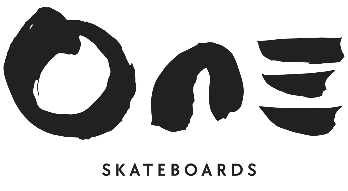
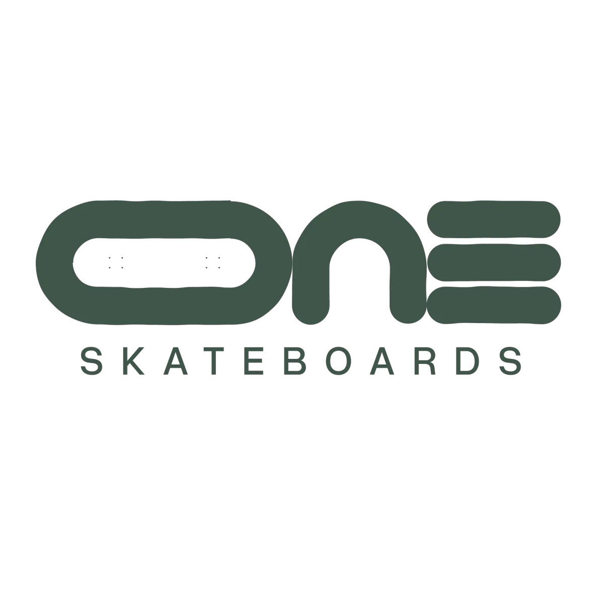
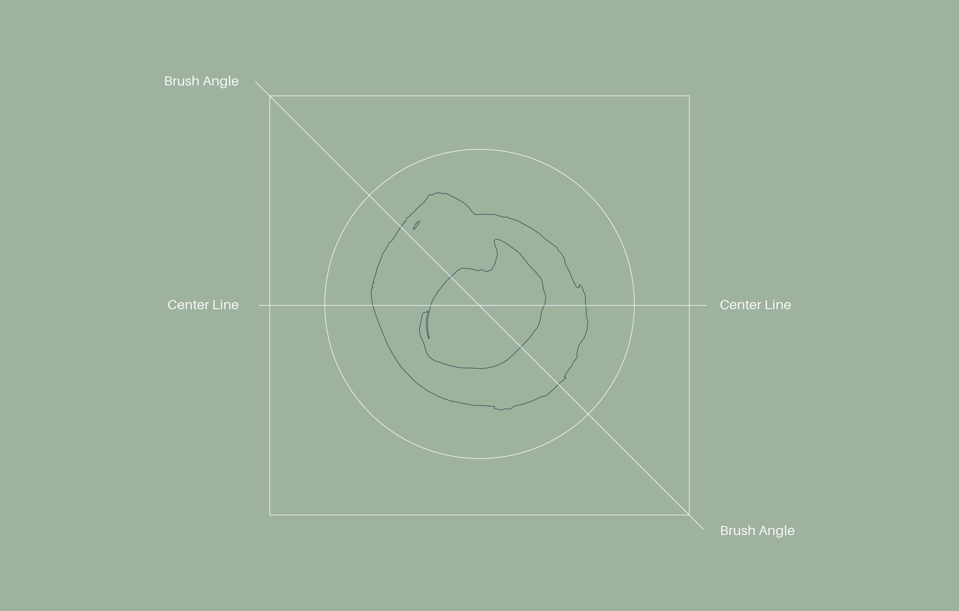
At the heart of the identity is a hand-rendered ‘O’, symbolising the eternal cycle of nature. Applied across decks, apparel, merchandise, and digital platforms, the bold grounded identity unites the skateboarding community while honouring its connection to the natural world.
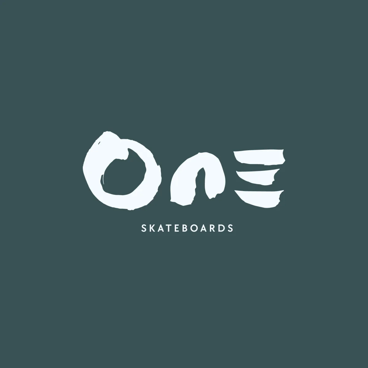
The 'grid' of the One Skateboards ident is loosely symmetrical; but like nature itself, doesn't conform to sharp angles or perfect geometry. The mark was created using a fluid stroke with a traditional calligraphy brush in order to maintain a natural mark.

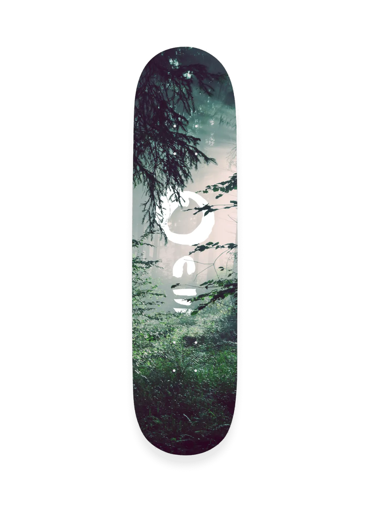
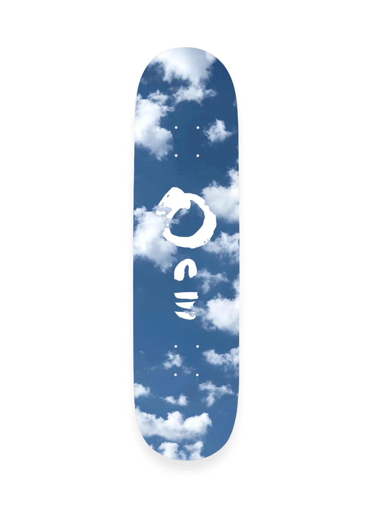
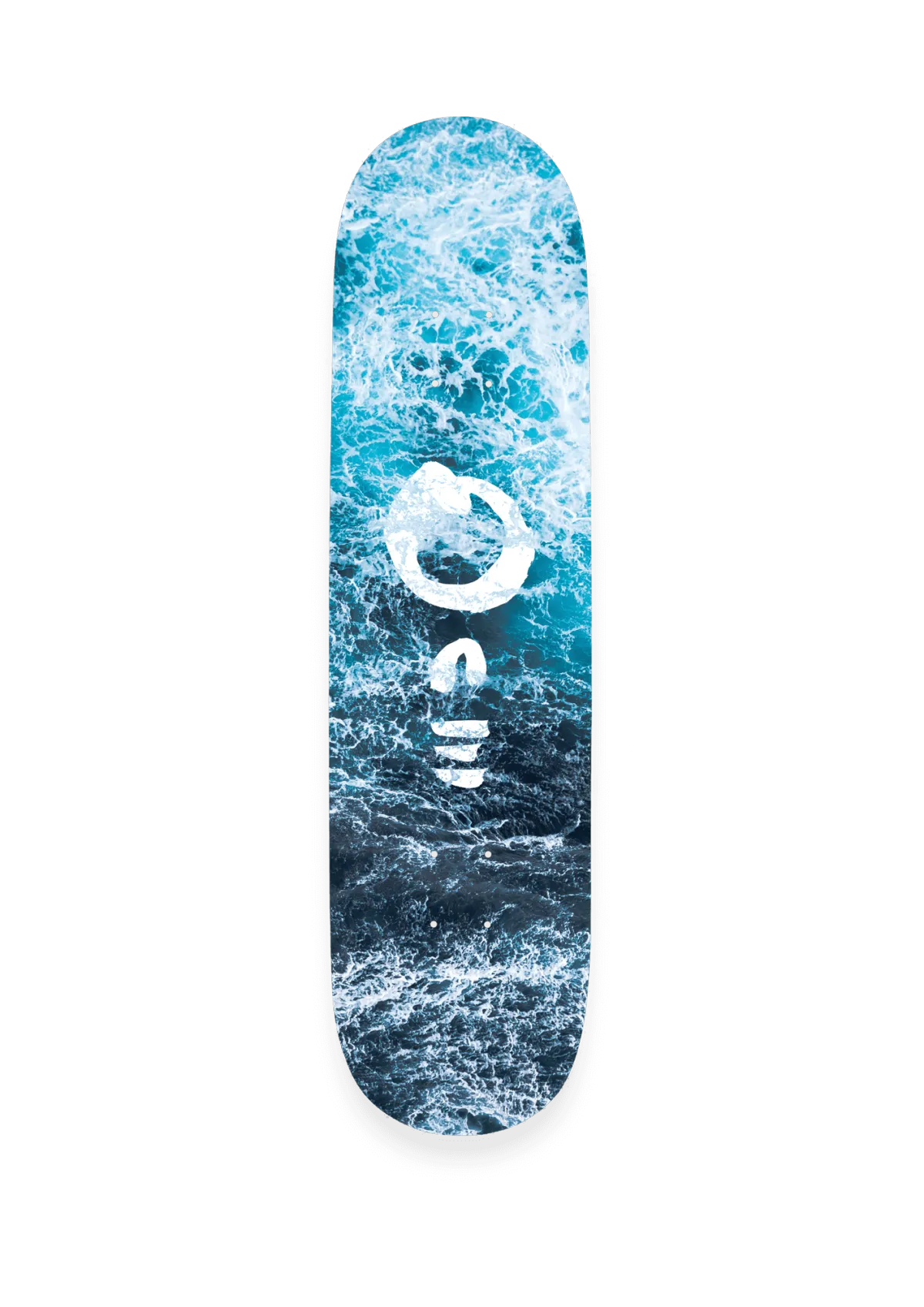
The second sprint to the project, saw the design of three skateboard decks, each with a graphic of a vertical 'one' wordmark; becoming one with each element. Earth, air & water.
"Just awesome, I love it! - the brand is even better than I could have imagined!"
Chris Rolland // One Skateboards
▼
Start Your Project
Got a project to start? Click Get Started below.